Monday 30 October 2017

Planning: Evaluating the film shoots

When we filmed in the abandoned building location, I feel that these are the things that went well:

  • Because of the good weather, we were able to film exterior shots
  • Because of the wind, in the exterior shots we have Emily's hair blowing in the wind
  • Good natural lighting was in the interior shots, providing soft light through the windows

However, these are a few things that we found difficult:
  • Because both of our stars are not too fond of heights, it was difficult to get them onto the introduction shot on the rooftop, and the final verse was recorded at reasonable heights as well, making the stars a little anxious. However, this was fixed as we all sang the verse together to reassure the singer.
  • The opening shot which included the female star spray painting onto a wall was quite difficult, as the wind was getting out of control, and the paint was very difficult to apply. We resolved this by waiting out the wind and painting from a closer range.
  • The shot with The Dorothy shoes was quite difficult to shoot as the shoes were a little too big for the actress, therefore she found it quite difficult to get her heels to touch.
  • In the actual location, the ground floor was very dark and difficult to maneuver in, therefore it took is some time to find our way around into the lighter parts of the building.
  • Because we could not find an empty brick wall in the building, we had to settle for shooting only one of the opening sequence in the location.

Sunday 22 October 2017

Planning: improved company label


After discussing the logo of our company with my workmates, we came to a conclusion that the extra parts outside of the CD were unnecessary, therefore I removed them.

Planning : Greta's house Story Boards


Planning: Brigg Town Story Board


Planning: Dividing responsibilities between the group


In order to prevent any misunderstandings, we created a list of things that we are responsible for during filming days. I think this will help avoid any issues with leaving things behind, as everyone will be fully aware of who needs to bring what.

Planning: Risk assessment for Greta's house


Planning: Risk assessment for Brigg exterior shots


Planning: Risk assessment for Brigg Town


Thursday 19 October 2017

Planning: Risk assessment for Abandoned building location [BRIEF]


After creating this risk assessment, and looking at others, I realised that the quality of this risk assessment table is too low, therefore I created  a new, better version of it.

Planning: Call sheet for filming [BRIEF]


After speaking with our teacher, I realised that this call sheet is very low quality, and did not give out enough information to the actors or the crew, therefore we created a new one. I feel like the improved version is much better than this one.

Tuesday 17 October 2017

Planning: The name of our star

We thought about possible names for our stars a while ago, but never came up with something successful, however, today, we thought about keeping our actor's last name 'Champan' and Ryan thought of the name Chase to compliment it, which we all agreed on, as we thought that it sounds catchy and interesting.

Monday 16 October 2017

Planning Group Post : Script Breakdown Location 5

Planning: Location 4 script breakdown

Planning Group Post : Script Breakdown Location 3

Planning Group Post : Script Breakdown Location 2

Planning: Location 1 script breakdown

Research: Conclusions of research into music videos

  •          I am seriously considering using a closeup as our first shot in order to let the audience see the star right from the first moment the video starts
  • ·         If we decide not to use a closeup, we will use a long shot in order to get the full body of the star and show the audience in fully who will be performing in the video

       ·                     I would like to make my fonts, even if they are different have some sort of similarities (kerning...)
       ·                     Use photos that appear natural and not forced, such as these when the band is performing
       ·                     I really like the way the song titles at the back are not in the middle, and might experiment with something like that
  • If the song that we choose is too short, or we would want an introduction, we could also create a mini narrative before the song begins
  • I would like to try interesting costume that can possibly represent something
  • Strong, bold makeup
  • Choreography
  • I am considering using signs to represent some issues and create intertextual references within my own video
  • I would love to be able to create massive signs such as the one with the lights on the building, however we cannot physically do that
  • This inspired me to consider walking into camera 
  • I will consider creating a few different narratives within the music video, however I feel that it would be very difficult and confusing for the audience to follow
  • Raise powerful questions to the audience about our society and the issues we face as individuals.
  • I really want to try and use lighting to create similar silhouette effect on a performer, although it depends whether it would suit my genre
  • The use of props/ movements that could represent lyrics
  • interesting effects, such as the mirrored effect on the singer
  • I must consider the colour scheme that will take pace not only within the digipak, but also within the music video which will create an incredibly strong synergy
  • Consider unconventional costumes, which will bring in a wider range audience, such as a man with makeup, tattoos etc...
  • Carefully think about choreography and how serious/ easy going  I want the video to look like in the end
  • I could use intertextuality within my own music video
  • I could refer to things through costume
  • I should change costume a lot throughout my video
  • Singing into camera creates a relationship with the audience - I should use it too
  • I could also use star images that do not physically match the actual performer's voice, however, I am unsure whether that would appear as normal as it did in this video
  • I could also use similar locations to create some of my shots (school halls)
  • I could use a wide range of actors to create diversity within my video
  • We should try and get the female's hair blown in the wind for a dramatic effect
  • we should try and get shots from either right or left of frame in order to avoid all shots being centered
·         I now know the meanings behind playing card symbols and we could use each one of them for different purposes and connotations, thus including symbolism and greater depth within our music video
  • We could use binary opposites in our music video as well as in this one
  • Dancing to show the more carefree side of our stars could be incorporated
  • The symbolism behind masks and gestures EG: death waving in a friendly manner
·         We will have to work really hard in order to make sure that the audience understands that the genre of the music video is not rock, but indie rock.
·         Using a strong colour scheme is important


Sunday 15 October 2017

Research: Possible magazines for our advertisement

When considering which magazines we would like to advertise our star's new album, we had to consider the fact that our genre is mixed between indie and rock, therefore leaving us with more options. However, we also had to take our audiences age into consideration, as advertising our star's album in a magazine designed for a young teen audience would not benefit us in any way. Therefore, after thinking for some time, we thought that having Vintage Rock, The Wire, Q and possibly Kerrang. The reason why choosing Q or Kerrang would be a safe way to advertise is because these magazines promoted Arctic Monkeys previously (our song choice) , therefore I could predict that these magazines would advertise Chase Chapman well also.

Whilst looking for example pages for album adverts in the magazines I could not find any online from these particular magazines, therefore I could not complete this homework fully. However, I did find some advertisements that are of artists similar to our genre from unknown magazines that I felt looked very successful and Eye Catching.


Research Group post: TA 3 - Chirbit


Check this out on Chirbit


My findings:

  • Although the location is rural, it links to the indie conventions of locations, as they are low budget, thus appealing to the audience who are interested in the genre
  • The more urban costumes clashing with the rural area are something that the audience likes, as there was nothing said about the costumes for improvement.
  • Due to the questioning of the knife, we decided that we will not use this in the music video, as it looks way too violent for what our ideas were for the music video, also the audience did not understand the link to the knife, therefore we will replace this shot with something more appealing.
  • Due to the cards being a little confusing to the audience, we will try to use the cards as a strong and sometimes obvious indicators as to what they represent in the shots, and we will also try to use them as a way to foreshadow the future shots/events in the video.
  • Due to not being able to use the train tracks, we thought of another way to show the sense of journey after completing this audience research.
  • Although we wanted to use the sunflowers, we cannot do that anymore, as at this time of the year the sunflowers are gone.
  • After speaking to the audience about the instrumental issue, we spoke about how we could fill those gaps in, and now we have a plan for the filming.
  • When discussing the shots which show the male being more vulnerable the audience responded well, which encouraged us more to go through with the concept of the modern male and female.

Friday 13 October 2017

Research Group Post : Target Audience 2 Analysis

Positive Comments:

  • A much better exposure. Could you frame with the supports across the river?
  • A lovely shot, it would make a great CU in the music video
  • Like - no clutter in the background!
  • A super, clean shot with just a little burn out from the flash. I like the diagonal composition.
  • I love this shot - great for the music video, you could really get the light to play around and flicker on and off the blade.
  • The strength of this is the diagonal composition. You may be able to add artificial flare if you wanted to highlight such.
  • I like the location but not sure about the plant and intrusion of the metal on the left.
  • Excellent job of keeping the shadows out.
  • A lovely shot - could be intriguing if you put blue screen in the mirror and then added the male star moving in it...
  • I like this - two objects - two people/ stars - a couple! 
  • I particularly like this one - but what about the partial plant? I presume that is intentional?
  • A lovely shot - you could get this cropped on final cut prox into an ECU
  • What about filming this and highlighting/ emphasising the 'forever' - would that work with your lyrics anywhere?
  • Nice shadow less shot. Just need to photoshop out the top right corner.
  • A lovely shot - I think you could film this - maybe where there are problems in the lyrics you could separate the cards and show them messy?
  • I like this medium shot pose however, she doesn't look very happy, she looks quite bored. I like the dungarees and mustard coloured top too - the make up is good on the female however, the male has very red eyes- perhaps some foundation is needed for him too.
  • A lovely shot and I like the way her hair is blowing. Could be really nice cropped for use on the digipak
  • I too like the hair blowing. She looks quite worried. A lovely shot
  • A lovely expression and pose- could be good for the digipak. It may benefit from cropping.
  • Really expressive - I love this shot. Cropping it to just below his hand would really draw their eyes into the shot and to the audience
  • A great costume - I think this would be a good costume to use in the music video. She's not looking into camera which you need for promo materials so I wouldn't use it on the digipak or advert.
  • A lighting issue here and quite aggressive. He looks washed out.
  • This is somewhat better and has attitude. It depends really on what your intended/ preferred meaning is [Hall reception theory]
  • That's a nice shot, I like the way he's leaning into her. Very subtle and well posed. It may work on a pane of the digipak
  • A lovely shot, nice angle and could be cropped to a great medium shot
  • A great shot. Crop it to a medium close up perhaps as the house in the background is distracting
  • Back to back shots can have all kinds of 'not seeing eye to eye' connotations. If they are singing, it might be easier for them if they stand in a slight V rather than fully back to back.
  • I love this location and think it is really atmospheric. You could place your star in either light or shade. Is his name Jay?      

Negative:

  • Are you planning on using this? Is it disused? Remember it is illegal to trespass on used railway tracks!  
  • The jacket/costume on the male star isn't very effective - it looks too big for him. The lighting washes them out and expressions do not connote positivity.
  • A lighting issue here and quite aggressive. He looks washed out.
  • Strange pose and expression - quite off putting! 
  • Why the back of a clock, the ornaments, the shield etc? There is a bike in the shot as well
  • For a promo video - it's not very attractive.
  • No. What age is your target audience?


Response to Positive:


From what can be seen here in the positive feedback we have received it is clear that our principle photography roughly adheres to the conventions of the Indie genre when looking at the comments and making comparisons to our music video research. I think all but one of the costumes used adhere to conventions of an Indie music and they also attract our TA. We have linked some of the costumes to semiotics and also used them to create synergy for the plans we have for the colour scheme on our digipak. In addition to this we also have reached out to our working class audience by having our artists wearing cheap, casual clothes. We also have a broad range of locations which has also received good feedback, we have a range of different locations that are urban, suburban, busy, abandoned, compact and out in the open so we have near enough ticked all of the boxes for this,  we can also link some graffiti at some locations which provides our TA with a small, extra story line within the narratives which may unfold some of the unknown. Some of the poses by our artists within the principle photography adhere to indie conventions yet they also begin to raise questions to the TA, e.g. Why does the female look confused and sad whilst staring into the distance?


Response to Negative:


The first negative comment highlights the fact that it is illegal to walk on train tracks as it is deemed as trespassing and dangerous, therefore we cannot use it in our video which is a shame because we were going to use it as a discrete method to represent journey and how you can roughly predict what is in the near future, but cannot even begin to imagine the long term future. We think this would've been very effective when supporting the narrative towards the TA, we still intend to use it if we can get permission from the owners of a railway that is temporarily out of use in Louth.
The jacket also isn't effective on the male star in the image pictured above and this is understandable, it doesn't really have any colour towards it and looks bland and dead, this could be a reflection on the spirit of the male star in the narrative in the video however this could be portrayed more clearly using semiotics and linking it with clothing. The pose on the photo is also very off putting and I think it washes away the emotion and story lines in the narrative, therefore I agree with this and we will use another image of them for the behind the scenes images that portray them in a different light rather than what is shown on this image.  

My own comment:
Just as Ryan said, we should think about the train track location and find a less dangerous one that could represent the same thing, but would be easier to access for everyone. This could be carried out as long as we can get permission to film in Louth.
We should also look into some more dynamic poses that intrigue the audience more, however, in my opinion having some calmer ones that are not as 'dead' as Ryan mentioned would be useful too, as when we looked into indie music videos, they are not filled with movement throughout all of the videos, and some shots do include staying still, as they reflect the concept of thinking.

Monday 9 October 2017

Planning: Photoboard


Dominant colours: 
Yellow
Red
Black
Cream

These colours will help with the synergy in our music video, as one of the most dominant colours is yellow. This colour directly links with the lyrics of the video, as the title of the song is called 'Old Yellow Bricks.' The representation of joy and happiness within the colour can also be used when positive aspects in life are addressed through lyrics and visuals.
The red that is used within the props and the costumes  represent the danger, passion and sex appeal. The relation to Mulvey and the male gaze will be a theory that we will be adhering to with the colour and the voyeuristic costumes/movements, and we rely on the colour red  a lot in order to use this theory.

The use of black and cream in the shots are used to link to the lyrics which refer to nostalgia, and the thought that things were better back then. So we use these colours to try and represent this longing for nostalgia.
The black links more to the neutral/ earth tones within the costumes and the props/locations, as the dark colour links heavily to the rock overtones within the song that we can either pursue or ignore.

Costumes:

We used some contrasting costumes for both stars in order to show diversity and make the costume change meaningful. For example, the first costume on the male is a dark green/black costume which links more to the grungy/rock side of the song, and the neutral/negative parts of the song due to the darkness within the costume. We also have a slight costume change when the neutral shirt can be replaced with a black one, and during this, when we took photos we decided to give the star an aggressive expression and a vulgar gesture of the middle finger. Therefore, the dark dominant outfit can signify the negative and the aggressive side to the song.
We also have a navy/dark green flannel top which creates a more rural look for the male, however, we felt like the costume was missing something, and therefore, upon reflection, we will incorporate the red scarf in order for the singer's costume to tie in with the female's.
However, to contrast both of these costumes, we also asked the star to wear something yellow, which is the opposite of the dark outfits we have seen before. There is no back, as the colours that the star is wearing consist of yellow blue and brown. This can link to the more cheerful, hopeful lyrics and show the more content side of the star. We also decided to use the yellow in order to get the visuals to link with the lyrics (Goodwin's theory).

The female also has four costumes, which compliment the male's. The first costume consists of a Yellow jumper and a blue jean pinafore, which links to the male's yellow outfit. However, we will not have the two actors wearing yellow at the same time, as the costumes will clash too much and be too bright. I believe that we will use them when we would like to accentuate on one of the actors more than the other.
We also got the female actress to wear a red, voyeuristic outfit which will be used more when we would like to appeal to the female and the male audience (Mulvey) by using our female star.  The use of red could be linked to the more romantic, passionate moments in the music video which can relate to the symbolic meanings behind the cards that we will use. Not only that, but we decided to use this outfit with a very calm dark green one from the male, and we thought about adding a small red component to his costume would link the two together really well.
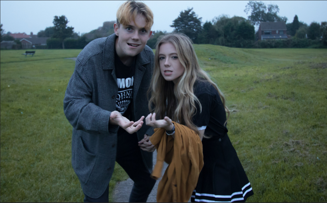
To compliment the dark outfit that our male star has, we got the female to wear a complimenting, feminine black outfit that consists of black heel boots, black knee high socks, a black skirt and a black top. Because black and black does not clash as aggressively, I believe we could possibly use the two dark costumes together if we needed.
Finally, the female has a more casual denim costume which consists of a dark green striped top, a denim jacket, distressed black jeans and chunky black boots. This outfit could go with the male's khaki shirt top, as the colours are in tune and together, which can symbolically show that they are in tune with their emotions, and stable.

Location :
Even though the rail road links to escapism we will be unable to use this location as it is illegal and highly dangerous. The path seen in the bridge image links to our target audience as this is seen of a sense of journey/travel, as our target audience are aspirers they seek travel and change. Many of the locations adhere to the conventions of indie as these are easily accessed places. Furthermore, the bridge and the alley way will give the music video a grunge/rock appearance, which we know the target audience like due to the questionnaire. We had decided on using more rural locations as we can access these and challenges the conventions of indie music videos, as they are usually urban. However, we are adhering to an aspect of this convention ,as these locations are also low budget, just as they usually are in indie music videos.

Props :

We decided to use a red lipstick as this connotes danger, love and sex appeal which links to Mulvey's theory of the 'male gaze'. The yellow spray paint and paint links to the song title 'Old Yellow Bricks' as well as the costumes worn by the actors. Furthermore we plan on using the yellow paints in a rebellious and teen angst, 
which is used to portray youths in our music video.

Friday 6 October 2017

Planning: Principle photography: stars and costumes (Rhea & I)


On the 2nd of October, Rhea and I took the stars into a local park and took some photographs of them before we started filming. Trying out different angles, framing, facial expressions and costumes really helped us see what we want to create in our music video regarding the overall look, the colour schemes and the acting we want the stars to achieve.
From this collage I learned the dominant colours which are mainly primary, creating a great focal point for the audience to concentrate on.
I feel like creating this board also helped us see what type of dynamic poses would work really well in our music video, and what type of shots, or filters wouldn't work. For example, the shots of Emily with her hair blowing in the wind create a very emotional shot, and the red being in contrast with the green can suggest the internal conflict in her. I feel like these undertones in our photography make the shots not only aesthetically appealing, but also very meaningful regarding the representations that we want to touch upon in our music video.


Thursday 5 October 2017

Planning:Selection and Rejection: principle photography of stars

After posting the principle photography photographs on Flickr, I received some feedback which helped with reflecting on what types of shots would be useful for the music video. The promo package and the digipak, and most importantly, on what types of shots we should look at during our next photoshoot.


After getting feedback on the facial expression of the female as it is seen that she does not look happy, we will try and portray a different type of expression on both of them, as our genre and the song are not related to happiness and is more concentrating on leaving criticism on society and making intertextual links, also due to the fact that stars in indie/rock genres do not usually smile, and more often have a neutral facial expression. The incorrect expression was my mistake for not informing the stars about what I wanted them to do, and this will be improved next time.


Regarding the feedback  received on this shot about how good the natural hair looks when blowing in the wind, we decided that I will try and incorporate a similar shot, with the hair blowing in the wind for a dramatic effect. The location will be different, simply  because when I did this photo shoot, I did not consider the locations because I am not in charge of location photography, but rather the stars and their costumes. 


What I learned about the use of such photos through feedback is that using colour is useful in order to portray the style and possibly connote things. The use of the mustard yellow signifies the name of the song and the intertextual reference to the Yellow Brick road.


This was a really successful shot and the audience thought so as well. I think that we could use this photo in some way for our launch of the star, as I believe the vintage colours and the neutral expressions link to the genre really well. Also,just as one comment mentioned the road behind them, the meaning behind it is a journey with mystery and the unknown ahead.


When I took this photo of the female star, my main intention was to show the change of costume that will also be incorporated in the music video, and the feedback that we got on this shot says that the colour scheme that we are having is good and the muted colours within the shots are good as well. The reason I muted some of the colours in some shots was to see what effect it would leave, also because of the constant reference to nostalgia in the song of our choice.


Looking at the feedback on this photo, I think that we definitely should use a shot like this in our music video, as the female's face is not aggressive, and it contradicts the gesture that they are pointing at the camera. The rebellious spirit can be seen through this photo because of the facial expressions, the slight leaning towards the camera and each other can signify that it is not a very unpopular way of thinking about how bad the society is today.


For this shot, I wanted to experiment with the cooler tones being more forward and giving the overall shot a cold feeling, which looking at the feedback has worked. The moody expressions are generally usual in indie/indie rock music videos, therefore I asked the actors to look that way, to see what the outcome would be. Although this shot does adhere to indie music videos, I am unsure whether we will use this as it appears that the audience does not seem to like the expressions.

The carefree, relaxed movement on this shot was quite interesting and our TA thought so as well, as we received suggestions that we should use shots/movements like this in our music video. When thinking about this, I think we could use shots like this when the lyrics are lighthearted.


Having our female star in a relaxed pose and slightly leaning back is a nice and a natural shot, however,  the photo is too wide  and there is a need for closer shots, therefore, for improving this type of shot, I would either crop it, or get closer to the star in order to take the photo.


The use of a star leaning forward, at a slight low angle and leaning more towards the right ride of the frame. However, reflecting on the feedback that we received we should crop down the photo and bring the star closer to the audience in order to create a stronger relationship, also, when we use the actual locations that we have planned on using, we will make sure to get rid of any distractions in the background, however, as this is not one of the locations that we are considering, there is not a reason to worry about the background.


The reason why I took this shot was to try and experiment with different poses and see what effect they would leave. The feedback that I received tells me that the use of such a shot would be interesting in the music video, which is why I will seriously consider using such a conflicting pose in the video.

How this research influenced my planning and creativity: 
  • We should try and get the female's hair blown in the wind for a dramatic effect
  • we should try and get shots from either right or left of frame in order to avoid all shots being centered

Monday 2 October 2017

Technology trial: Final Cut Pro X 2


Today we learned how to remove parts of the film using the blade tool  that we uploaded on the timeline, also we learned how to disable sections of the video ,and overlay them.


We also learned how to put generated gaps in the video, which helps by creating a valuable space which doesn't cut the video short.
What was one of the most valuable things that we learned today was placing markers in parts of our video in order to show which parts should be synced to the song which is placed below.